Thursday 10 December 2015

High Poly Asset Modelling

The object I decided to model for my High Poly Asset, is the sword Chaoseater, which is used by the protagonist of the videogame Darksiders. 


The sword features a mixture of sharp and jagged edges, carved, organic looking faces and a mixture of different metals for the separate components of the blade.

High poly model in Maya


To create the swords basic shape, I used the Quad draw feature to get the very specific shapes that the sword has. Since the sword is asymmetrical, I had to mirror it on a different plane than other swords. This carried over into the modelling process in Zbrush, which allowed me to further enhance the quality of the blades details, especially the faces.


Completed High Poly Model

However, parts of the swords, such as the more pronounced teeth and the detailing near the hilt that I primarily modelled in Zbrush suffered distortion when they were completed and this unfortunately carried into the Low Poly model as well. 

Following the high poly models completion, I used decimation to reduce the poly count and make the low poly version.

Colour Map
Since the blade itself has two different types of metal, I broke up the blade in the colour map so I could insert so the early textures into it.

Textures applied using Quixel
Without Textures in Unreal 4

With Textures in Unreal 4


Group Project - Box Art

When designing the front cover I wanted to use a very simplistic design, to better portray the focus the game has on psychology and draw the player’s eyes to the bizarre mixture of colours used within the game.


I decided to mix together the rainbow of colours that we’ve used previously in this project and the black block shapes reminiscent of Rorschach tests. As for composition, I took some influence from Andy Warhol’s painting of Marilyn Monroe, both because of its use of colours and the pop art visual fights with the aesthetic of the environment we are creating.

Group Project - In Game Posters

Since the posters are decorations within the player characters subconscious, I decided to name several of them in a much the same way that drugs or other illicit substances would, as well as making the designs reflect this intoxicating or potentially dangerous feeling.


Bone Dust – A white powder that could be visually linked to Cocaine.

Mandrake – Phonetically similar to Marijuana and has an intimidating jungle design.

J.O.Y – An appreciation similar to LSD.

Lightspeed – A play on Speed. Unused.

There’s also some symbolism in the fact that several of the posters are “Sold Out”, indicating that the main character could be running out of options and his addictions can’t support him anymore.


While not all of these designs were used, I think that they all convey a different tone and indicate different facts about the characters history outside of the game as well as his attitude towards these substances, since he's linking them to something that many people publicly idolize. The best designs seem to be those that use very simple blocks of colour, rather than more intricate patterns or flourishes.

Group Project - Environment Art

The group decided that the club will be divided into different areas in varying levels of decay. It also has a hybrid ascetic, with a more traditional design near the front and more modern features in the adjoining rooms. I worked closely with James to figure out the exact spacing for the different rooms and props.


To keep the rooms somewhat consistent, even when there's clearly very conflicting levels of quality between the different rooms, I decided to include interlacing wooden beams that add in the retro look of the first room and leads the players back to it if they get lost.


For  this variation of the design, I repositioned the stage and adjusted the dimensions of the bar to allow the players to access the area behind it. I also changed the layout of the lights to account for the new stage location. I also added a pile of crates to make it seem like there was still equipment to be set up and this part of the club is under construction/renovation.


Initially, I was going to use more earthy colours since the club is located underground, however this didn't mesh well with to colours near the entrance. Instead, I changed it to a blacker colour and switched the carpet to a deep purple.


Lastly, I added in some seats and some lighting to set the mood.

Group Project - Reference Research + Character Design Development

Part 1: Research and Influences

To begin the project, I looked at various point + click games and how they present the images they show as well as their own visual styles.
Featured Games - Wolf among us, Tales from the Borderlands, I have no mouth and I must scream, Day of the tentacle, Tormentium, Grim Fandango, The book of unwritten tales and Monkey Island

Since our game also deals with hallucinations and manifestations of a persons innermost thoughts, looking at hallucination scenes from both games and movies was the next step.
Featured movies/games/Tv Series - Jacobs Ladder, Hannibal, Batman: Arkham Asylum, Batman Arkham Knight and Psychonauts

Lighting is also important and I looked for inspiration in a short animated film I'd found.


Part 2: Breaking the results down

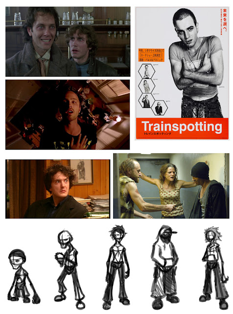
When designing the character, I looked at how addiction to various substances effects a person's physical appearance and some examples of this in media. Most drug addicted characters seem very obviously emancipated or even skeletal due to the negative side effects of the drugs their take. A lot of the characters I looked were also very wide eyed and crazed looking. While I didn't want this kind of expression to be permanent, I made a note the eyes would be something to emphasize. Unkempt hair was another common feature but I felt that could easily become too distracting in the design, and could be difficult to pull off given the limits to the poly count.

Featured Images - Whitnail and I, Black Books, Breaking Bad and Trainspotting + Rough Character sketches
I decided to use the design the incorporated a hood as it would put more emphasis on the characters eyes and make the player pay more attention to their overall body language. This is an important aspect of these type of characters as seen with Ewan McGregor's character in Trainspotting. People associate that pose with that movie and it's subject matter because it's very clear and very striking.

 
Types of Jacket
Character Poses and Expressions

For colour, making the character more saturated will make any colour of light show up quite well on him and further contrast him with any brightly coloured crazy imagery, also his skin is coloured to more resemble a decaying body or a zombie, taking a more literal image of drug addicts. As for his eyes, I originally went for something sharper but dialled it back to make them look more natural, allow they are still coloured to resemble a nocturnal animal. His hat was also an interesting feature since we decided it could be used as an extension of his expression by making it bend and stretch with the characters eyebrows.

Prototype designs A + B and Expression/Alternate Eye shapes
Measured Character Guide

Tuesday 8 September 2015

Summer Project - Cyborg Character (In Progress)

             When conceptualizing the character, I knew I wanted him to be agile and to have a very clear distinction between his organic and mechanical parts. To compliment the more streamlined shape of the cybernetics, the character would have mutations that were both odd in colour and varied in shape, almost like trails of smoke and flame made from the characters skin. This also led to the idea of giving the character fire powers or fire based abilities.
            Of the sketch I lined up, Sketches B, F, J and L seemed the most interesting and made the most sense from an anatomical perspective. They all have a very agile look to them and both their clothing and mutations would complement their movements, which would be important in an action game. F looked like the best choice since it more resembles a humanoid despite its augmentations and would be able to fill the role of a playable character.
            To better draw in the details on the coloured character, I created the 3 Perspective View image first, to serve as an accurate guide for the character. It also let me adjust the characters proportions, simplify some details and determine which parts would have to be modelled or simply be left as textures.

            For colour, since the character's mutations closely resemble fire, I gave them a red, burnt colouration, which could be further built upon in modelling, by adding a texture reminiscent of burns or burnt skin. This also lead to part of his clothing also being red, to give the look a certain flow along one side of his body. The characters armour also needed to be clearly mechanical, so it uses a lot of silver and black colours, as well as a dark saturated green. These parts also feature a hexagonal pattern, particularly on his shoulders and chest, both of which could be applied in the texture phase. The characters skin also had to have a clear distinction between its mutated parts and the cybernetic additions, so it's a notably sickly pale colour and any parts leading into mutation would be bordered by black veins on his skin.

            Initially I used a cube to construct the body but during this, I realised that I was having to subdivide the mesh so much that the polycount would be far too high for this point in the project. Also, this method made modelling the head very difficult since I couldn't accurately adjust it, again due to the unnecessary faces and vertices.

            For the second attempt, I used a more traditional figure modelling method, using cylinders as a base and constructing the features of the face separately from the rest of the head. Since the character has asymmetric components to his design, the symmetrical elements took priority. This also extended to parts of his body such as his feet. These were modelled as separate meshes and attached rather than simply extruding them from the rest of legs. This also helped create more even meshes for parts such as the shoulder plates and the armour on his right arm.

            The legs also needed some consideration, since they had to be designed for an additional point of articulation. This was resolved by simply looking at some reference of 3D models of Raptors or other creatures with similar legs.

The cloth strips on the back of his belt were made from a single flat plane.

Thursday 18 June 2015

T-Rex Modelling - Re-Submmission

NOTE: Screenshots of the earlier stages in the models creation were lost due to technical difficulties.


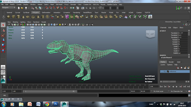
I found that without reference, it was difficult to judge the width of the model, which lead to it appear much thinner than I would have liked. The tail also tapers to a weird point which could be solved by ending it with a face and a flat end rather than grouping the vertexes together.

Completed Claws

Completed Feet


Smoothed Model

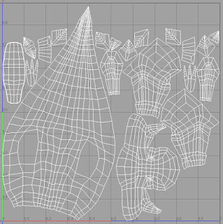
Finished UV Map

The UV mapping was difficult to get my head around due to the irregular shapes and the more finicky details. Since most of these problems came from trying to work with a whole model, I split back into two halves and created the new UVs, with the Automatic Mapping Tool and some minor adjustments to the edges and faces, particularly to the mouth and the hands.

Finished Model with a UV Edges Visible

While the model still closely resembles the guidelines, I think that using a combination of straight and curved edges would improve it's appearance. I also felt that the hands seemed to flat in places and could have benefited from additional polys if not for the limit on the poly count. 
Alley 3D Model Textures - Re-Submission


I chose to give the bricks a more red hue but also to tone the colour down to make them so that they'd look more aged and worn.


All Textures added

To vary the wall, I added a second type of brick texture below the stone border. I also made the arch over the grate part of the walls texture since I could add better lighting with the emboss effect in Photoshop.

With Specular and Normal Maps added

I think that if the Sewer Grate was actually raised off the ground, it would look better than the flat texture and make better use of the Specular Map. I did however, alter the individual lights and darks of the Grate on it's Specular Map, to give it better depth and lighting. I was very satisfied with the effect that they created and thought of ways they could be used in future work, such as the Summer Project.

Class Work Re-Submission - Lizard "Dude"


Darks and Shadows
Lighting added
Colours and Scale Textures added

Thursday 26 March 2015

Spring Submission - Blackbird: 2D Retro Space Shooter

For our group project, I was in charge of designing the enemies and any potential bosses. I tried to create a mixture of organic and mechanical inspired designs, with a wide variety of shapes and colours. I also decided that the basic enemies would have either red or blue glowing parts and the bosses would have purple.


16Bit Sprites


I also came up with a concept for the bosses, that they would have a primary stage that would shatter, revealing the 2nd form underneath. Unfortunately we weren't able to implement any boss battles, so this concept was unused.

Boss Transformation Sequence

Another unused concept was the Rival; A ship that would appear at random intervals and would get progressively stronger. Like the boss battle, time prevented us from implementing this.

Unused Rival Ship


As for the coding, I was able to insert animated sprites of explosions into the enemies scripts. 

Sprite Sheet for a Blue Explosion